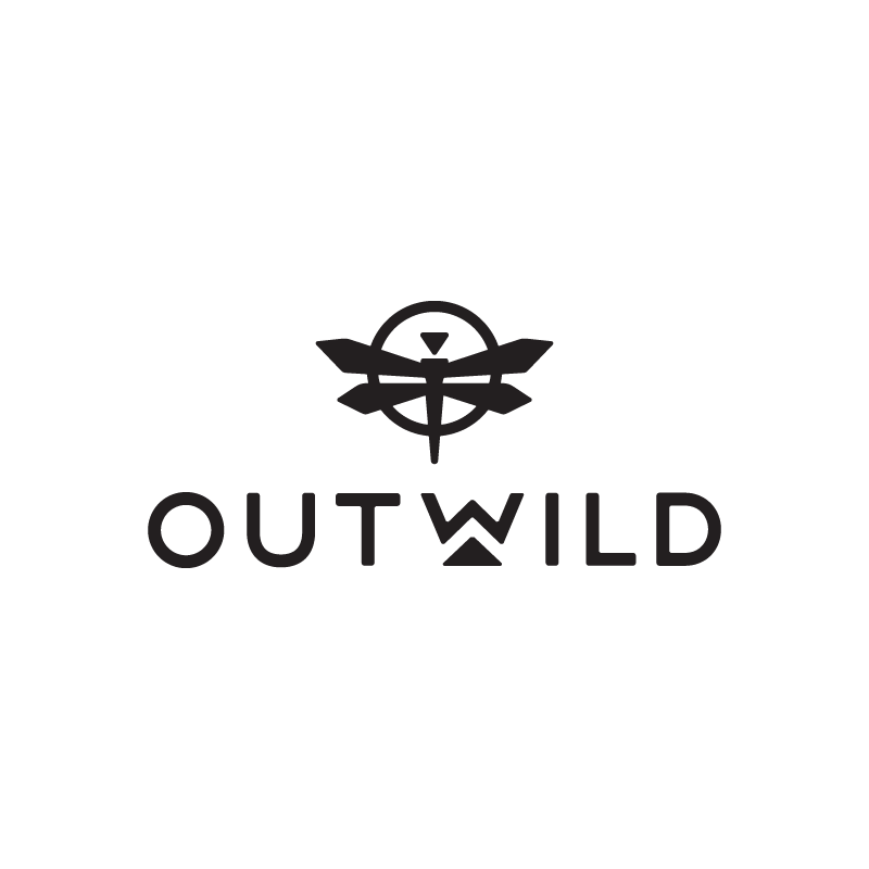
Outwild Logo Refresh
The Outwild team needed to refresh their original lightweight logo to be more visible on apparel and physical products. Our goal was to keep a similar look and feel to the current logo, but with bolder lines, filled shapes, and softer corners. The other changes included removing the double line circle and scaling down the dragonfly to maintain visual balance with the newly filled shapes.
Scope
— Discovery & Strategy
— Refreshed Identity System
— Application Examples